Creating a Generic og:image Representing this Website
2019-06-21
In order to display optimally when shared to social media, every page of this site makes us of basic Open Graph metadata, in particular the og:image property.
The image used is the following:
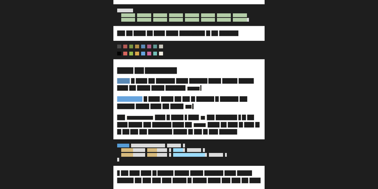
That is a screenshot of the post Introduction to Coding with SASS via Including ANSI Output in HTML altered such that all words are replaced by boxes matching the color of the underlying text.
Want to see it in action? Try clicking here, or bookmark that link and click the bookmark on any page you want to completely redact.
How did I do this?
findAndReplaceDOMText
First I wrapped each word in a span using findAndReplaceDOMText, a handy library for targeting the text in a DOM tree without concern for the DOM itself.
All I needed to do was run the following in the browser console (Firefox, Chrome).
findAndReplaceDOMText(document.body, { find: /\S+/g, wrap: 'span', wrapClass: 'blankout' });
The above targets all sequences of non-whitespace characters and wraps them in a span with the class blankout.
currentColor
Now I can target those spans with a bit of CSS using the little known currentColor value to set the background-color to match the color property.
This is accomplished by adding the following via the browser CSS pane (Firefox, Chrome).
span.blankout {
  background-color: currentColor;
}
That is all that's required, except...
Screenshot
Several considerations arise when taking the screenshot, including the size and aspect ratio, the DPI, and the optimal compression.
Size and Aspect Ratio
The optimal size and aspect ratio for open graph images is a matter of uncertainty. It differs between social media platforms and within the same platform by how it's viewed, and these standards change over time.
Without a marketing team devoted to optimizing per platform I made a best guess attempt, settling for the size 1500 x 750 which is a 2:1 aspect ratio.
Taking a screenshot of the correct size and aspect ratio is possible using Device Mode in Chrome, or Responsive Design Mode in Firefox (linked in the next section).
DPR (Device Pixel Ratio)
With a Retina display, and possibly under other conditions, it's necessary to set your device pixel ratio (DPR) such that the screenshot is sized correctly.
This is can be done in either Firefox via Responsive Design Mode or Chrome via Device Mode.
oxipng
Once the screenshot exists, ensure it isn't any larger than strictly necessary. PNG compression can accomplishing this without degrading the quality. I recommend oxipng.